What Makes a Cigar Band Award-Worthy? 3 Lessons From Oliva Serie V Melanio
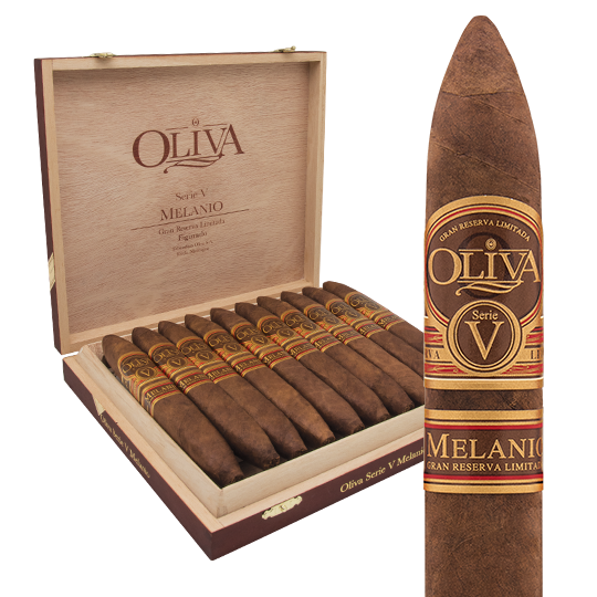
Some cigars win Cigar of the Year and you can’t quite explain why the band feels inevitable in your hand. The Oliva Serie V Melanio is one of those cigars. A Cigar Aficionado top-rated release. A box you spot at the back of the humidor and reach for without checking the price. And once you have the stick between your fingers, the reason becomes obvious. Brown. Gold. Red. A single serif V the size of a family crest. Four Spanish words on a sash: Gran Reserva Limitada. Nothing flashy. Nothing modern. Nothing trying.
That restraint is the design. The Oliva Serie V Melanio band is one of the most quietly confident pieces of premium cigar band work in the modern humidor, and it carries a specific lesson for anyone considering a custom cigar band design for their own brand: an award-worthy band isn’t the busiest band on the shelf. It’s the one that earns its place there. Three deliberate choices — the letterform, the palette, the copy — carry the entire signal. Here’s what each one teaches us, and how to translate it into a band for your own cigar.
Why Award-Worthy Cigar Band Design Matters More Than You Think
A cigar band is the smallest piece of real estate in your entire brand — and the most public. It’s the only piece of packaging that travels with the product into the moment of enjoyment. The cellophane is in the trash. The box is on a shelf at home. The band is between two fingers at a wedding, at a closing dinner, at a poker game. It gets photographed. It gets pointed at. It gets remembered.
The bands that win awards — the ones magazines photograph, the ones reviewers reach for as examples — all share a common discipline. They commit to a single signal. They refuse to compete with themselves. They use color, type, and copy as positioning rather than as decoration. They don’t look like they were designed; they look like they were composed.
Most custom bands fail in the opposite direction. They cram. A logo competes with a country-of-origin mark. A vintage fights with a blend code. Decorative borders compete with the wordmark. The result is a band that says everything and signals nothing. Compare that to the Oliva Serie V Melanio band, which says three things on purpose — a letter, a palette, a manifesto — and lets the rest stay quiet. That’s the bar.
A Case Study in Recognition: Oliva Serie V Melanio
The Serie V Melanio sits at the top of Oliva’s portfolio. It uses a 10-year-aged Ecuadorian Sumatra wrapper, Nicaraguan binders and fillers, and is named in honor of Melanio Oliva, the family’s founder. The Figurado vitola was named Cigar Aficionado’s Cigar of the Year in 2014. Inside the leaf, it’s a family-blender’s cigar. Outside, it’s a family-designer’s cigar.
The band system has two visible components — a primary band carrying the serif V in brown and gold with the Oliva wordmark, and a red secondary sash carrying the words Gran Reserva Limitada. No metallic flash. No filigree. No competing icons. The reduction is the design, and the reduction is exactly what makes the Oliva Serie V Melanio band a study in luxury cigar band work. Three lessons sit inside that reduction. Each one is a principle a brand can lift directly.
Lesson 1 — A Single Letter, Doing Double Duty
The serif V on the Melanio band is doing two jobs at the same time. It names the series — Serie V, the fifth premium line in the Oliva portfolio. It also anchors the entire composition as the central decorative element. Most cigar bands separate those jobs. The wordmark sits on one side. The decorative center sits on the other. They negotiate for attention and split the eye.
Melanio collapses the negotiation. The letter is the wordmark and the ornament. The serifs are weighty enough to read as a crest. The proportions are generous enough to fill the band without crowding the Oliva script underneath. One letterform doing the work of two design elements. That’s economy. That’s a brand confident enough to ask a single character to carry the load.
When a Single Letterform Anchors a Cigar Band
The single-letter-as-crest move works when three conditions are true. First, the letterform has to be drawn (not selected from a typeface) with care — the serifs, the weight, the proportions should feel intentional rather than generic. Second, the letter has to carry meaning beyond decoration; on Melanio, the V stands for Serie V, so the visual is also informational. Third, the rest of the band has to step back and let the letter lead — secondary type smaller, decorative elements minimal, color palette in service of the letter rather than competing with it.
If your brand has a strong founder initial, a Roman numeral (Serie I, II, V), or a single-word identity that compresses naturally, the single-letter approach is on the table. If the initial is visually awkward or the name is long, a tight custom wordmark is the better play. The principle is the same in either case — one mark, drawn with care, allowed to lead.
Lesson 2 — Earth Tones Say Agricultural Craft
Look at the Melanio palette. Brown the color of aged tobacco leaf. Gold the color of late-afternoon sun in a tobacco field. Red the color of barn paint and harvest sashes. These aren’t fashion colors. They aren’t branding-deck colors. They’re the colors of the soil the cigar came from.
That choice is deliberate, and it’s a powerful counter-move to the dominant cigar band palette of the last twenty years — black, gold, and chrome luxury. Black-and-gold says this is expensive. Brown-and-gold says this is grown. For a brand built around a family of growers and a wrapper aged ten years, the second message is the more honest one. The band signals provenance before the smoker has tasted a single puff.
Designing Palettes That Signal Provenance
Earth-tone palettes work because they carry built-in associations that don’t require explanation. Brown reads as leaf, as soil, as wood, as patina. Gold reads as sun, as harvest, as age. Red reads as warmth, as fire, as the sash on a working man’s shoulder. Pair any two of those and you’ve told a story about agriculture before you’ve added a single word of copy.
Contrast that with the default premium palette — matte black with metallic gold foil. It works, but it works as a generic luxury signal. It could be a watch box, a wine label, a perfume bottle. Earth tones are a more specific play. They say: this product comes out of the ground, and we’re proud of it. If your brand has any agricultural origin story — family farm, single estate, specific region — an earth-tone palette is a stronger signal than chrome luxury. Pair it with a foiled and embossed cigar band finish in matte gold rather than mirror gold, and the tactile read reinforces the visual read.
Lesson 3 — “Gran Reserva Limitada” Is Scarcity as Design
The red sash beneath the primary band carries four words: Gran Reserva Limitada. Translated literally, the words mean Grand Limited Reserve. Functionally, they say something more specific to the smoker: this one is rare; you got lucky.
Most cigar bands waste their copy. They list country of origin, vintage year, blend code, leaf type. Information that’s useful at the point of sale but adds nothing once the cigar is being smoked. Melanio uses its secondary copy as positioning. The words on the sash aren’t filler — they’re a manifesto. They tell the customer the cigar inside is finite, deliberate, and reserved. They turn the band from packaging into a small piece of marketing copy that sits between the smoker’s fingers for the entire smoke.
Writing Cigar Band Copy That Positions Premium
The copy on a band has to do one of two jobs: identify or position. Identification is the brand name, the line, the vitola — functional information. Positioning is harder. Positioning copy creates a feeling about the cigar before the cigar can speak for itself. Gran Reserva Limitada is positioning. Edicion Limitada is positioning. Hecho a Mano is positioning. Each phrase tells the smoker something about scarcity, craft, or pedigree — not about what the cigar is, but about what the cigar means.
When you’re writing copy for your own band, the test is simple. Read the words out loud. If they describe the cigar (a blend, a country, a measurement), they’re identification — keep them tight, keep them small. If they describe how the cigar should be valued (rare, reserved, family-blended, single-estate), they’re positioning — give them their own line, their own color, their own visual emphasis. The Spanish-language move on Melanio is doing extra work here, too. A Spanish phrase on a Nicaraguan cigar reads as authenticity. The language is the provenance. That’s a free signal most American brands leave on the table.
How to Apply These Lessons to Your Own Cigar Brand
If you’re designing a band for a new line or rethinking the one you have, the three Melanio lessons translate into four practical principles.
Pick one mark and let it lead. Whether it’s a single letter, a small crest, or a tight wordmark, decide which element is the load-bearing visual of the band and design every other element to step back. If a customer can’t recognize your band from across a humidor by the lead mark alone, you have two competing marks, not one mark and a supporting cast.
Choose a palette that tells a story. Black-and-gold says generic luxury. Earth tones say agricultural craft. Pastel says boutique. Monochrome says modernist. Pick the story your cigar actually wants to tell — not the story the category defaults to — and let the palette carry it. Earth tones in particular are underused in cigar band design and immediately differentiate a brand on the shelf.
Write copy as positioning, not packaging. Every word on the band should either identify the product or position the product. Identification copy stays small and quiet. Positioning copy — the Gran Reserva Limitada, the Edicion Limitada, the family-blender attribution — gets its own visual treatment, its own color, its own line. Words on a band are real estate. Use them on purpose.
Commit to finish. A great composition on a flat-printed band still feels like packaging. The same composition with a foiled and embossed finish feels like jewelry. Foil for visual depth, emboss for tactile depth — together they convert a printed strip of paper into the kind of physical object a smoker remembers a week later when they describe the cigar to a friend. The cost difference is meaningful but not enormous. The perceived-value difference is exponential.
Frequently Asked Questions About Premium Cigar Band Design
What makes a cigar band award-worthy?
An award-worthy cigar band combines a singular lead mark (a monogram, a single letter, a tight wordmark), a palette that signals story rather than category default, positioning copy that tells the smoker how to value the cigar, and a foiled and embossed finish that delivers tactile premium. The Oliva Serie V Melanio band is a textbook example — one serif letter, an earth-tone palette, a Spanish-language scarcity callout, and physical relief that rewards the hand as well as the eye.
What does “Gran Reserva Limitada” mean on a cigar band?
Translated literally, Gran Reserva Limitada means Grand Limited Reserve. In cigar context, it signals that the release uses specially reserved tobacco (often aged longer than the brand’s standard line) and is produced in limited quantities. On the Oliva Serie V Melanio band, the phrase functions as positioning copy — it tells the smoker the cigar in their hand is finite, deliberate, and reserved, before they ever cut the cap.
Why do earth-tone palettes work for premium cigar bands?
Earth-tone palettes — brown, gold, terracotta red, deep ochre — carry built-in associations with agriculture, age, and provenance. Brown reads as tobacco leaf and soil. Gold reads as harvest and sun. Red reads as warmth and the working sashes of the field. For a product that is fundamentally an agricultural good, an earth-tone palette tells a more honest story than the default black-and-gold luxury palette and differentiates a brand on a shelf where most competitors lean on chrome and matte black.
Can a single letter work as the main element on a cigar band?
Yes — if the letter is drawn with care, carries meaning beyond decoration, and the rest of the band is designed to step back and let it lead. The serif V on the Oliva Serie V Melanio band works because it simultaneously names the series and anchors the composition as a crest-sized visual. The single-letter move fails when the letterform is pulled from a stock typeface, when it carries no informational meaning, or when other elements on the band compete with it for attention.
How does a foiled and embossed cigar band increase perceived value?
A foiled and embossed cigar band uses two finishing techniques together. Foil stamping applies a thin layer of metallic or custom-color foil to specific elements under heat and pressure, creating reflective accents that catch the light as the band rotates. Embossing uses a metal die to raise design elements off the paper surface, creating tactile relief. The two techniques together convert a flat printed strip into a physical object the smoker remembers — not because of the wrapper notes or the country of origin, but because of how the band felt between their fingers. The cost increase over flat-printed bands is typically 30 to 60 percent. The perceived value increase is exponential.
Ready to Design a Band Worth a Cigar-of-the-Year?
At Cigar Bandz, we craft foiled and embossed cigar bands using the same finishing techniques you see on Oliva Serie V Melanio, Padron 1964, Davidoff, and the rest of the heritage names. Whether you’re launching a new line, refreshing an existing brand, or developing a limited reserve release that deserves the kind of physical signal Melanio gets, the difference between “a cigar” and “your cigar” sits on a quarter-inch of foil.
If you’re ready to talk through what your band could look like — the mark, the palette, the positioning copy, the finish — we offer a free 30-minute consultation. No obligation, no template pitch. Just a conversation about what your brand wants to say with the smallest piece of paper in your packaging.
Book a free consultation with Cigar Bandz
A great cigar band earns its place in the humidor. Does yours?
